 |
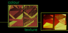
Searching materials (textures) of desired colour! The visual designer
must understand the difference between "colour of the texture"
and "texture of the colour". The term " Texture of the
colour " means, the change in the texture of the surface because
of the application of paint. There are number of paints available in
market which have a specific texture. However the study of colour of
the texture is more meaningful to the visual designer/architect. The
architect makes a meaningful choice of materials based on its function,
but never ignoring the colour of the texture. Most of the times, manufacturers
of building materials take care to make textures available in all the
colours (for example coloured tiles in the market). |
|
 |
 |
|
| workshop theory slides |
 |
|
 |
 |
 |
|
After
selecting/making an interesting composition (two-dimensional) with colours,
students should search for materials to replace each colour in the composition.
This is a very interesting experience. The architecture student should
be discouraged from the temptation to colour the materials. |
 |
The student will discover that certain colours might not look good with rough textures, whereas certain textures look interesting in any colour. Monochromatic colour schemes support a good texture scheme. Contrasting colour schemes may not look as contrasting in textures. Only monocolour textures make a very interesting textured mural in spite of the theory that a single colour makes the composition look boring and monotonous. |